- Return to book
- Review this book
- About the author
- Introduction
- 1. Language Elements
-
2. Language Blocks
- 2.1. Control
- 2.2. Function
-
3. Language Structures
- 3.1. Scope
- 3.2. Source
- 4. Advanced Functions
- 5. Data IO
- 6. Visualization
- 7. Libraries
title: "R plot base system" author: "Jiayi (Jason) Liu" date: "January 26, 2015"
output: html_document
Base system
The base plotting servers as the foundation of plotting in R.
General instruction
graph style
The following attributes can be used in most base ploting functions.
pchploting symbolltyline stylelwdline widthcolcolor
Here are some attributes controling the axes layout.
xlab,ylabxlim,ylim
Histogram
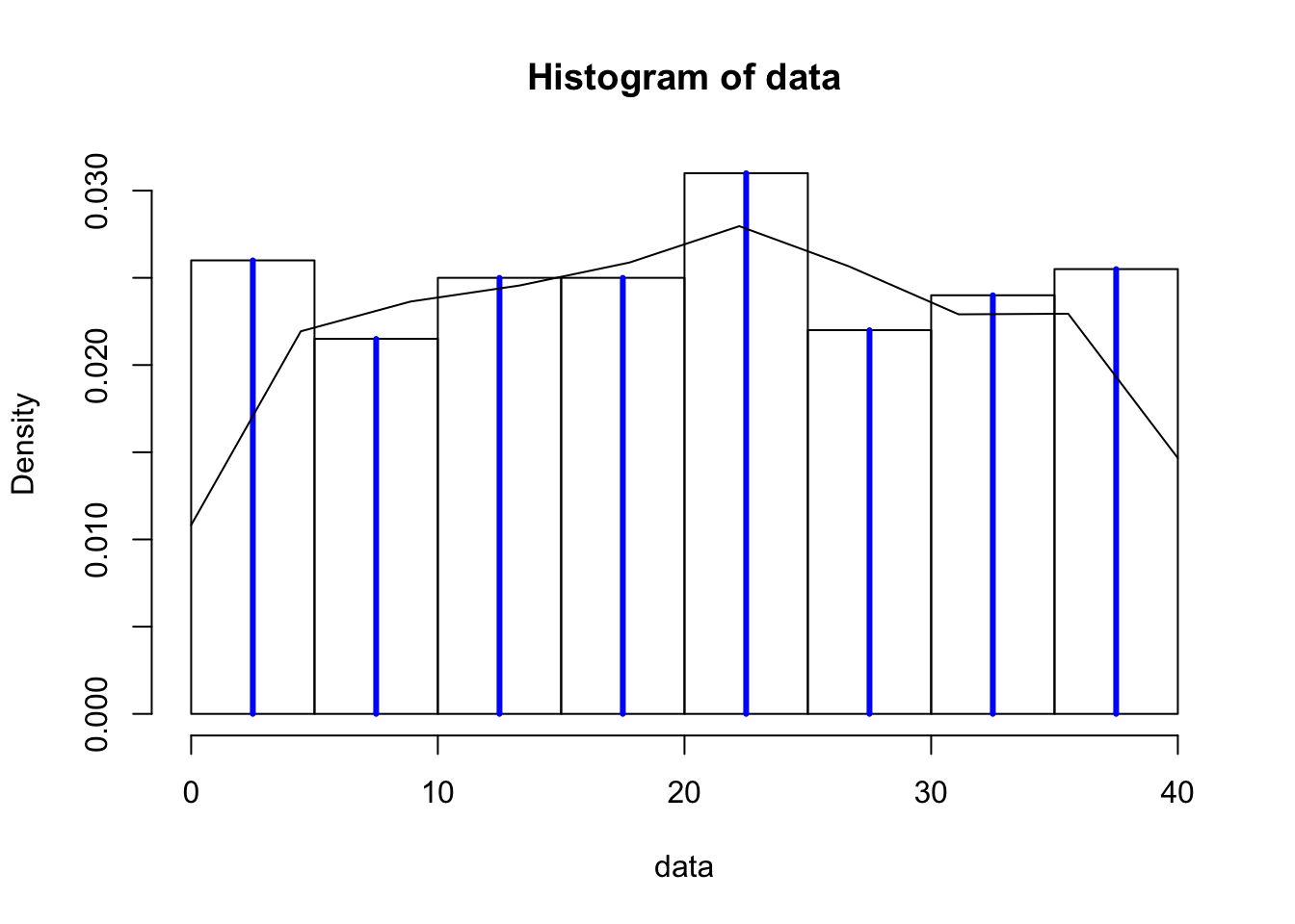
histtakes a numeric list and calculate the histogram. The most common tuning parameters arebreak(control breaking points) andfreq(return counts or probability). It also returns histogram class with values ofmidsmiddle points,countsanddensity.data <- sample(1:40, 400, replace=TRUE) x <- hist(data, breaks=10, freq=FALSE) lines(x$mids, x$density, type='h', lwd=3, col=4)
The last command lines is a general plotting function. Here we use it with type of hstogram, line width lwd=3 and color col=4.
densityconverts the data to a smooth distribution with specified kernel. Notice that the boundary effect might result problematic representation of the data distribution at discontinued places.h <- density(data,n=10,from=0,to=40) lines(h$x, h$y, type='l')
tabletakes variables as individual levels and counts for each. Withbarplotwe can also create the histogram.
Notice, forbarplot(table(data))barplot, it use the names of the data as the x tick labels.